
Anzu Identity
INFORMATION ー
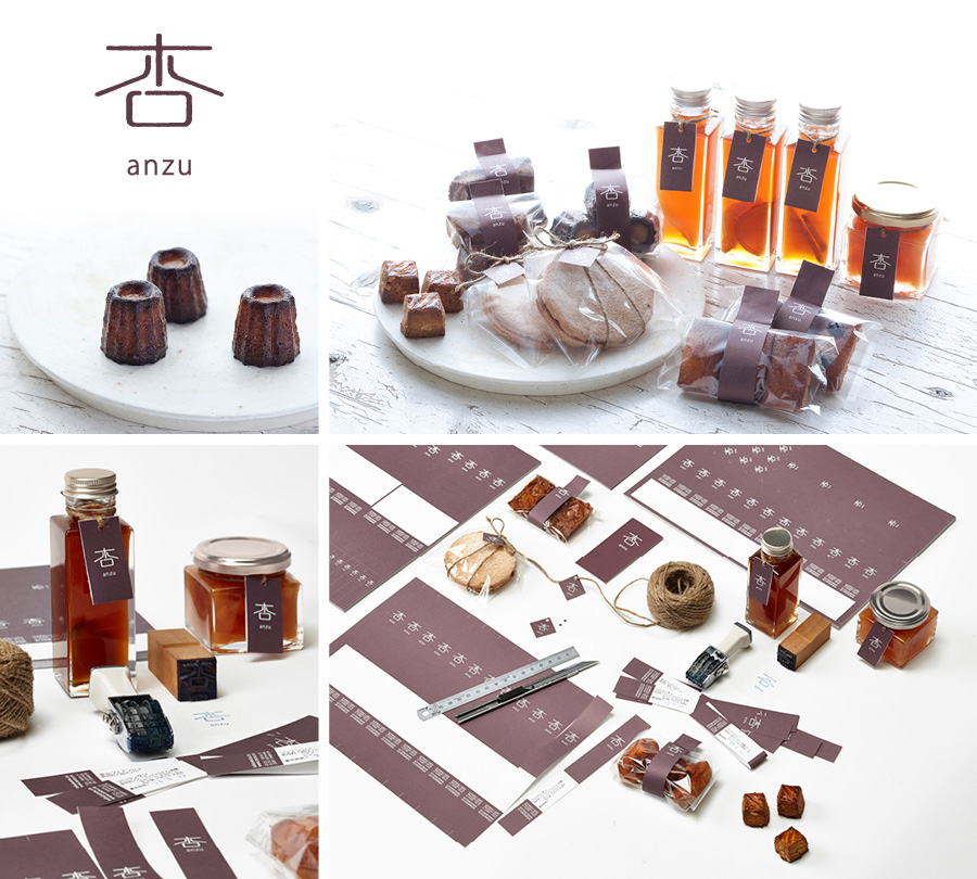
Mrs. Tabata asked silent to create an identity for her home made baked goods and marmalades. Anzu was chosen for the name, as it means almond in Japanese and its extract is often used for baked goods. We chose to use the Chinese character of the almond and treat it’s outline in a way to give it the beauty of imperfection, found in home made goods. Adding the transliterated name gives a western touch to the brand image.
CREDITS ー
Client: Anzu
Project: Identity, Packaging, Web
Year: 2010
MORE ー
www.anzu.co